The User Problem
Discussion
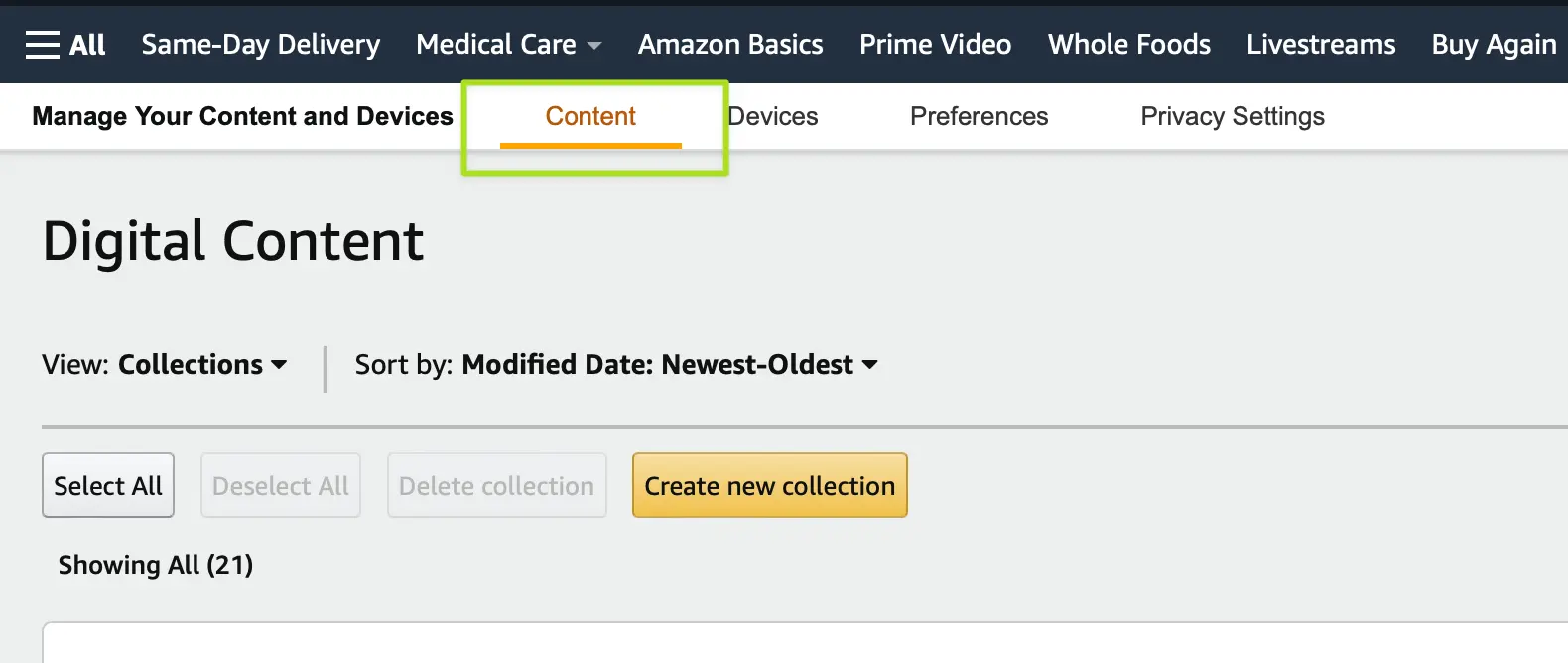
I read a lot of e-books and use the Kindle service to manage all my content. I frequently add an e-book manually to my content library but organizing them with the tools that Amazon provides is rudimentary at best, and quite easy to get lost in if you are not already familiar with the process.
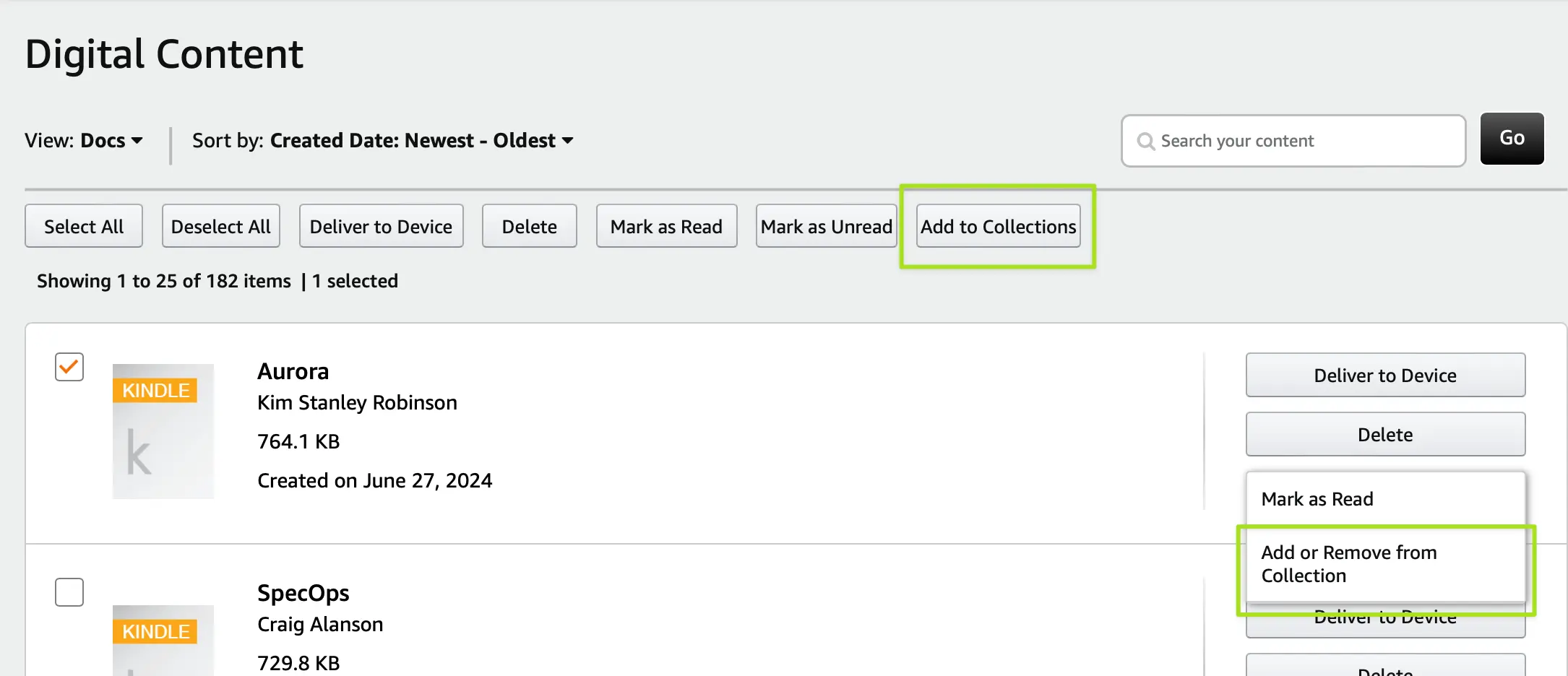
For me, the inefficiency begins with lack of clarity in how the seemingly identical operations actually work. If you select a book using the checkbox controls and click "Add to Collections" you get a dialog to add, but critically, this display does not actually show the collections the book might already be in! Instead, this top function is purely for adding, creating a scenario where the mechanism feels broken because it wouldn't show the change you had just made.
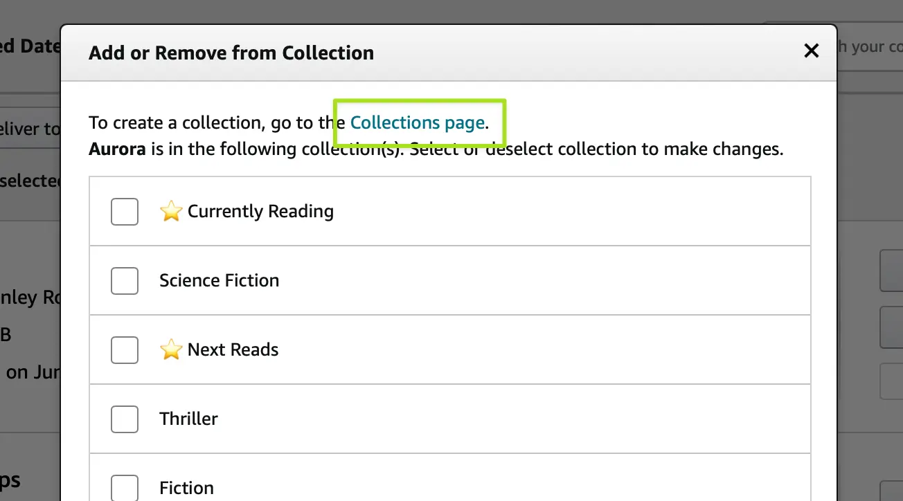
If you want to add, change, or remove, you have to look inside the vague "More Actions" button on each book row. The option here is similar-but-not-the-same function. Notably, if you choose this option you get the exact same dialog box as the previously discussed option, but this time you will see collections the book is already in. You can make adjustments (either adding or removing to any number of collections) but once again, this is visually identical to the "add only" function accessed by using the top bar.
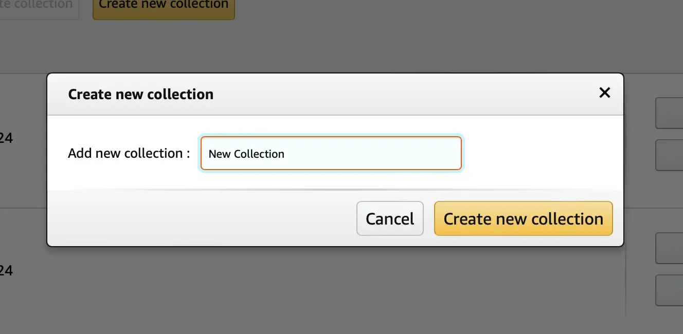
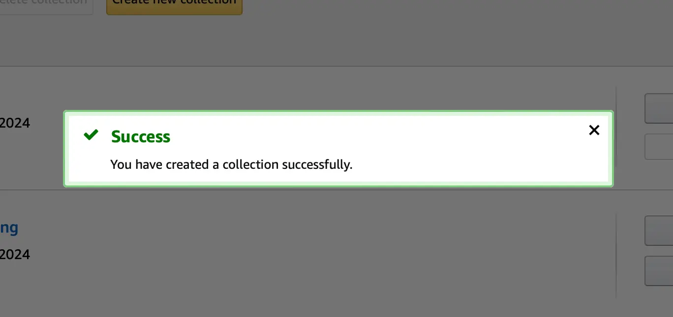
If a user wants to create a new grouping, they have to leave the process they were in the middle of entirely, losing all context and arriving at a new screen. After navigating the UI on that screen and adding a new collection, we hit upon another inefficiency within this part of the system. Every successful action is met with a modal dialog that you must manually dismiss before proceeding. This can be really annoying if you are try to add and organize more than one book, it's a constant stream of clearing modals.
Finally, provided the user made it through to creating their new collection, there is no indication on how to get back to where they were. The user needs to know that they have to click the already highlighted "Content" main navigation item, click back into their list of books, then find the book in question, and add the book to their new collection.
This process is painful, requiring far too many steps, forcing the user to make intuitive leaps on where they are, and needing the user to bear the load of navigating to where they have to be to do what is ultimately a simple action.
Proposed Solution